Sunday, July 12, 2009

Triangular Plot


A Triangular Plot is one that displays three sets of data or variables. The intersection of the three axis gives the class of the unknown.
This triangular plot shows carbonate rock composition from Tennessee, West Virginia and Pennsylvania in terms of the three components that represent carbonates, clays, and silica. The figures were calculated from published rock analyses.

Windrose


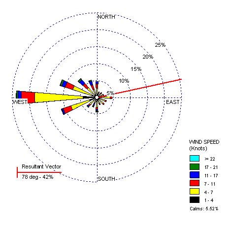
A Windrose is a tool used by meteorologists to represent which direction wind is blowing from (wind direction) and speed in a particular location.
This example of Yakima,Washington shows the wind's top speed was 17-22 knots at recording time.
http://www.climate.washington.edu/climate.html

Climograph

A Climograph shows a location's average temperature and precipitation. This is used to predict an area's climate.
This is an example of a climograph of Manaus, Brazil. From this information we see that the area has lower precipitation on the warm months and peaks in precipitation in October.
http://www2.volstate.edu/kbell/climographs.htm

Population Profile

A Population Profile is a chart that shows the number of people as a function of their ages.
It could inlude age/ sex distributions for a given region.
This profile is comparing Crookwell and Gunning Shires in Upper Lachlan. By looking at the data we see the population of 15-59 year olds is increasing in the Gunning shire while the Crookwell shire's population is increasing among the 60+ group.
http://www.envcomm.act.gov.au/soe/soe2004/UpperLachlan/population.htm

Saturday, July 11, 2009

Scatterplot


Scatter plots are similar to line graphs in that they use horizontal and vertical axes to plot data points. Scatter plots show how much one variable is affected by another. The relationship between two variables is called their correlation . Scatter plots usually consist of a large body of data. The closer the data points come when plotted to making a straight line, the higher the correlation between the two variables, or the stronger the relationship.
The above plot shows the relationship between ages of husbands and wives.
http://cnx.org/content/m10950/latest/

Index Value Plot

An Index Value Plot is a type of visualization map in which an index value is plotted on a line map. It uses index value instead of an absolute value.
This is an example of relative daily index closings among markets around the world.
http://www.mathworks.com/products/demos/shipping/garch/garchcopulaevtdemo.html?product=GA

Lorenz Curve

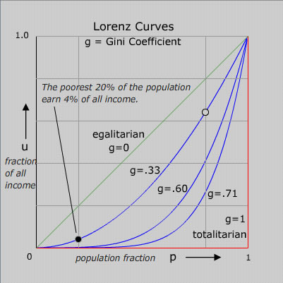
A Lorenz Curve shows an unequal distribution between two variables as a curve. The further away from a 45 degree angle, the greater the inequality.
In this example,the straight green line is the Lorenz curve of an idealized perfectly egalitarian society - where everybody has exactly the same income. The red Lorenz curve - horizontal and then vertical - is that for the extreme authoritarian or totalitarian society where one person has all the income. Curves for societies with intermediate income distributions are also shown.
http://chesters.org/marvin/GINI/index.html