Thursday, June 18, 2009

Cartogram


Cartograms are maps in which a thematic mapping variable is substituted for land area. The space of the map is distorted to convey the information of this alternate variable.
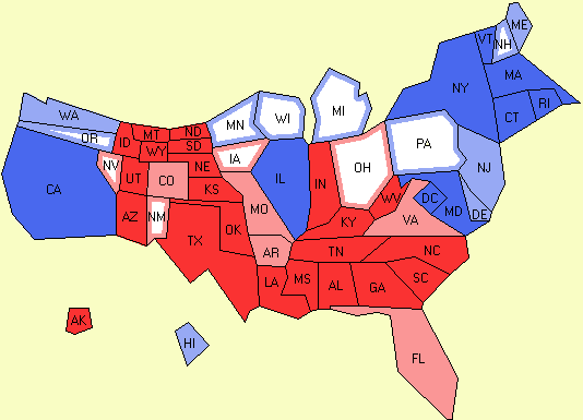
This is a Cartogram showing the results of the Electoral College in the 2004 Presidential election. Dark blue represented strong democratic states while dark red were strong republican. Outlines meant the state was barely one way and white were exactly tied. This cartogram is not a true map.

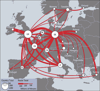
Flow Map


Flow maps are like a flow chart. They are often used for sequencing or ordering information. They also show amount of traffic or flow within a region.
This flow map shows telecommunications traffic flow among European nations. The thicker the line, the more minutes shared between the two countries in millions of minutes. This particular map also includes a proportional circle map representing the country's outgoing traffic to all other countries.

Isoline Map

Isoline maps have lines that connect points of the same value. They are also called isograms.
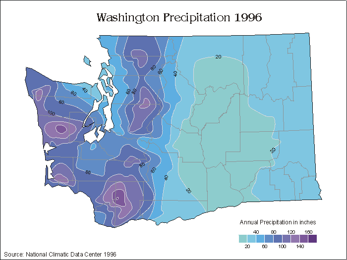
This is an example of an Isoline map showing precipitation of Washington in 1996. By connecting points of the same value, isolines are effective because they quickly communicate distributions being examined.

Friday, June 12, 2009

Proportional Circle Map


Proportional Circle maps use the size of a circle to represent the presence and size of a feature.
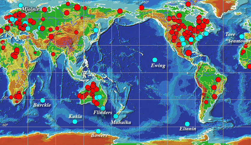
This map shows Impact- generated tsunamis. There are 185 known impact craters on the Earth. The size of circle is proportional to the crater diameter. Red color represent the impacts on land, light blue represent those in the water.
http://tsun.sscc.ru/tgi_9.htm

Monday, June 8, 2009

Dot Distribution Map


Dot Distribution maps use dots to show the presence of a feature.
This Dot Distribution represents population of the United States as indicated by the 2000 Census. The brighter the dot, the more dense the population in that area.
http://www.census.gov/geo/www/mapGallery/

Propaganda Map


Propoganda maps aim to influence the audience toward some cause.
According to the text surrounding the map, "Arab propagandists and biased irresponsible news services call Israel "expansionist" and the "aggressor" against Arab peoples'. From this map, one would see that Israel appears to be the smallest country by far- How could it be the aggressor? The cartographer emphasises the size of Israel in it's defense. http://israelsmessiah.com/palestinian_refugees/israel_vs_arabs.htm

Hypsometric Map


Hypsometric maps are topographic maps that shows elevations with color sequences that fill spaces between contours.

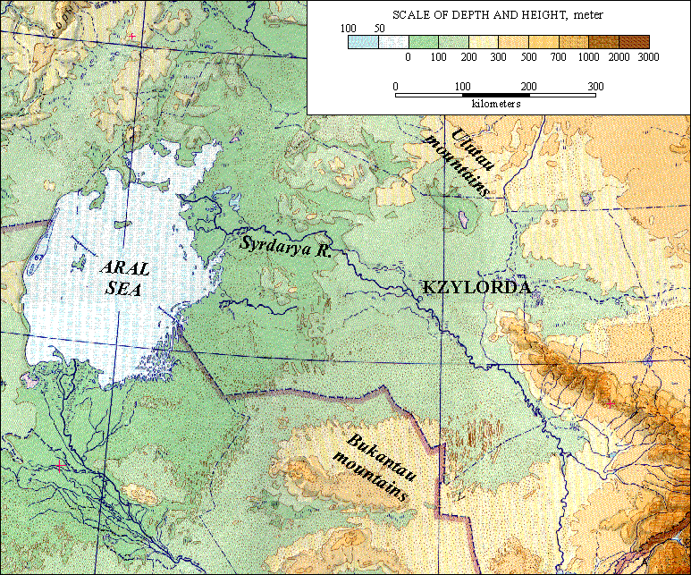
This Hypsometric map shows the elevations of Kzylorda using various color tones. In this hypsometric map, shades of green are used for lower elevations, shades of yellow or tan for medium elevations, and reds and/or browns for higher elevations.
In this example, the sea is about 50 meters below sea level as indicated by the scale. The highest mountain areas are dark brown and are about 3000 meters.


http://lu.com/odlis/odlis_h.cfm